The good hang: revisiting the spaces of the Milwaukee Art Museum
We’ve been under a stay-at-home order for over a week now, and a self-imposed quarantine for a week longer. I’m finally past the initial stir-craziness and am settling into a more productive routine, aided by the fact that we are still allowed strolls around the neighborhood. Even with these occasional wanderings, I find myself thinking about internal spaces a lot these days—how they’re designed and why, and what we do with those spaces once we’re in them.
Museums have always been particularly interesting to me in this regard, in part because I used to be literally surrounded by their carefully designed spaces on a regular basis, and in part because, even more than other structures, those spaces are self-consciously curated by so many people: the architects who designed them, the actual curators who present their collections in them, and the visitors who photograph them.
Of these three groups, it’s the curators whose relationships with the galleries are arguably the deepest and most active, at least once the buildings are actually erected. At the very least, their relationships are the ones I personally find the most interesting, because they are the ones that largely determine how I and other visitors interact with and understand both the spaces themselves and the objects within them.
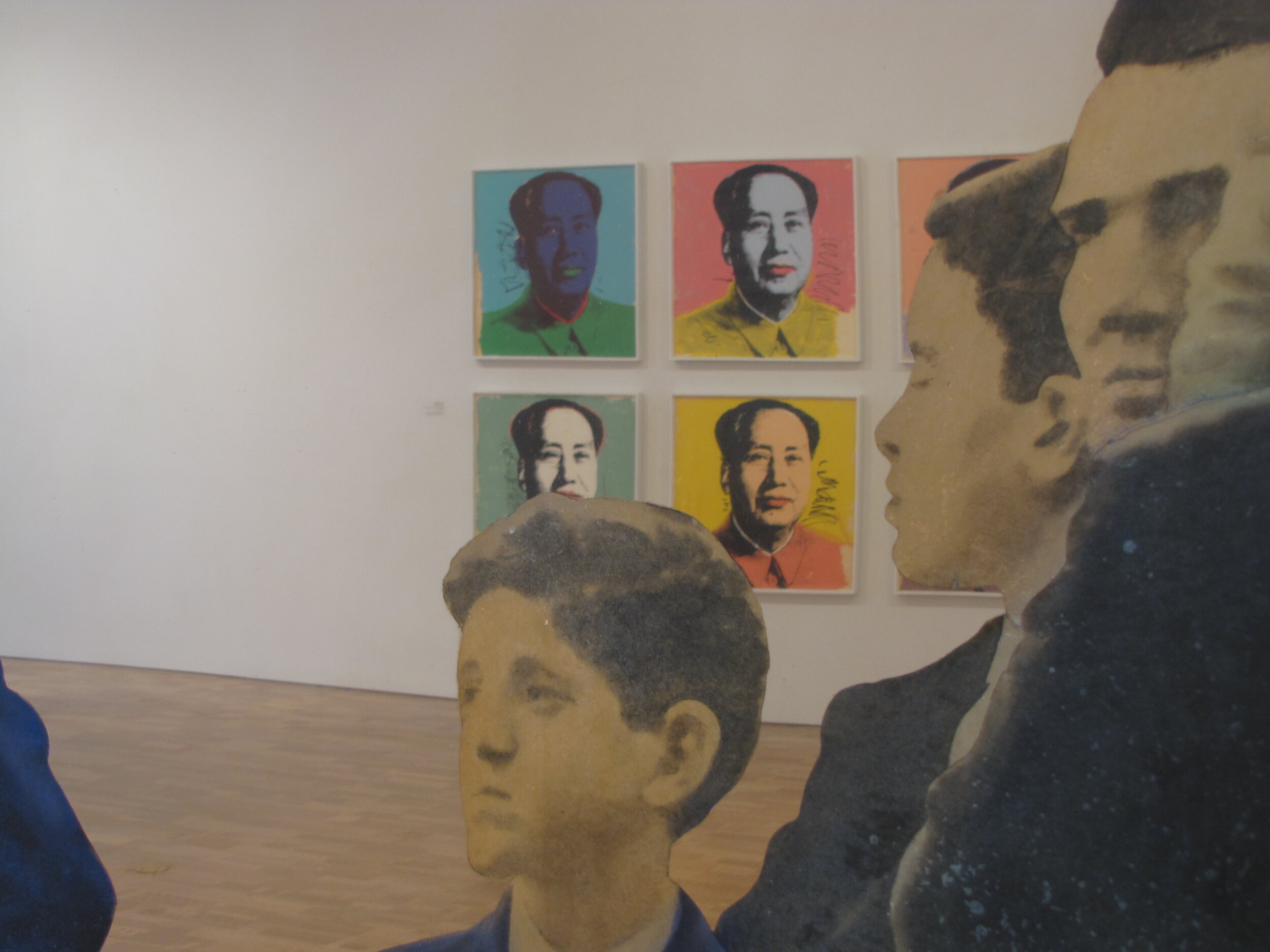
In curatorial parlance, a “good hang” is what happens when objects are presented in a way that tells a story, stimulating visitor insights purely through visual comparison. The good hang is also what makes walking through the galleries—particularly the contemporary galleries—of the Milwaukee Art Museum such a consistent visual and intellectual pleasure. Even now, when the only access I have to the galleries is through photographs viewed on a laptop screen within the confines of my home, I am still impressed by the intelligence and beauty of their arrangements, which serve the individual objects so well.