Before we begin
God. Damn. It.
I’m still processing (i.e., repressing the nausea induced by) the penultimate installment of Game of Thrones, “The Bells.” If I hadn’t already begun this piece weeks ago and announced my plan to write multiple essays on GoT, I probably would’ve abandoned the post to draft limbo, as much of my enthusiasm for the visual choices on display in “The Long Night” (s8 e3) has faded in the wake of the storytelling choices in “The Bells” (s8 e5).
Still, the ridiculous and irresponsible don’t erase the smart and beautiful, and the things that made “The Long Night” worth talking about still deserve to be discussed. However, I will be doing so in a more limited way than I had originally intended.
Let’s get to it
Despite my aversion to war and zombies, the Miguel Sapochnik-directed Game of Thrones episode “The Long Night” is now my favorite 80 minutes of television—ever. This is largely due to the visuals, which were so impressive yet so anxiety-producing that, on first pass, watching them was like being tortured while having someone press on the pleasure center of my brain.
The episode has been on my mind so much, in fact, that I had intended to dedicate two posts to it: one, here, to talk about the imagery, and another on Notes from an Editor to discuss the implications of the internet’s (and my) complex reactions to the plot. Given the show’s recent turn, however, I’ve decided to wait until after the series concludes to complete the post for NfaE.
Anyway.
Within the maelstrom of battling undead, the use of a limited color palette, severely restricted light, repetition, and careful composition all work to not only draw the viewer’s attention to important plot, character, and thematic moments, but to hold the extremely complex episode together.
Color
Even given its overuse in recent movies, the contrasting teal-orange color palette of “The Long Night” avoids cliché because it feels natural within the specific context of the episode. That naturalness is largely a product of years of visual foregrounding, of separately establishing the equally contrasting forces of ice and fire with the respective color schemes of blue/white and red-orange/black. Their collision here is therefore not only dramatic, but a visual expression of the culmination of years of storytelling coming to a thematic head.
Darkness and Light
Many viewers are (understandably) frustrated by the severity of the darkness used throughout the episode and the confusion it caused them. But that frustration is also the point. We don’t experience the battle purely through the characters, but rather with the characters; their confusion is our confusion. And that decision to directly involve the viewer is exactly what elevates this depiction of battle above its predecessors, including the Two Towers’ influential Battle of Helm’s Deep.
The darkness’s oppressive omnipresence also means that we work harder to see what we can, and that makes the moments of light all the more impactful, the things it illuminates impossible to miss.
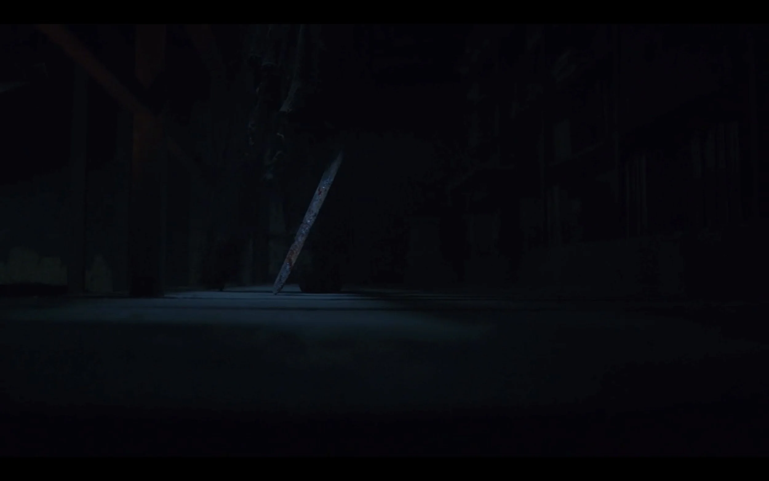
We can barely see the wight rambling through the library, but his bloodied sword—and all that it represents—is perfectly clear.
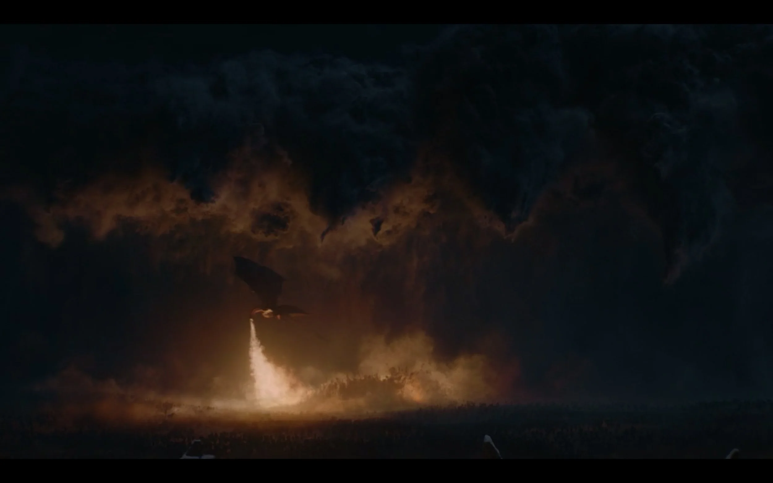
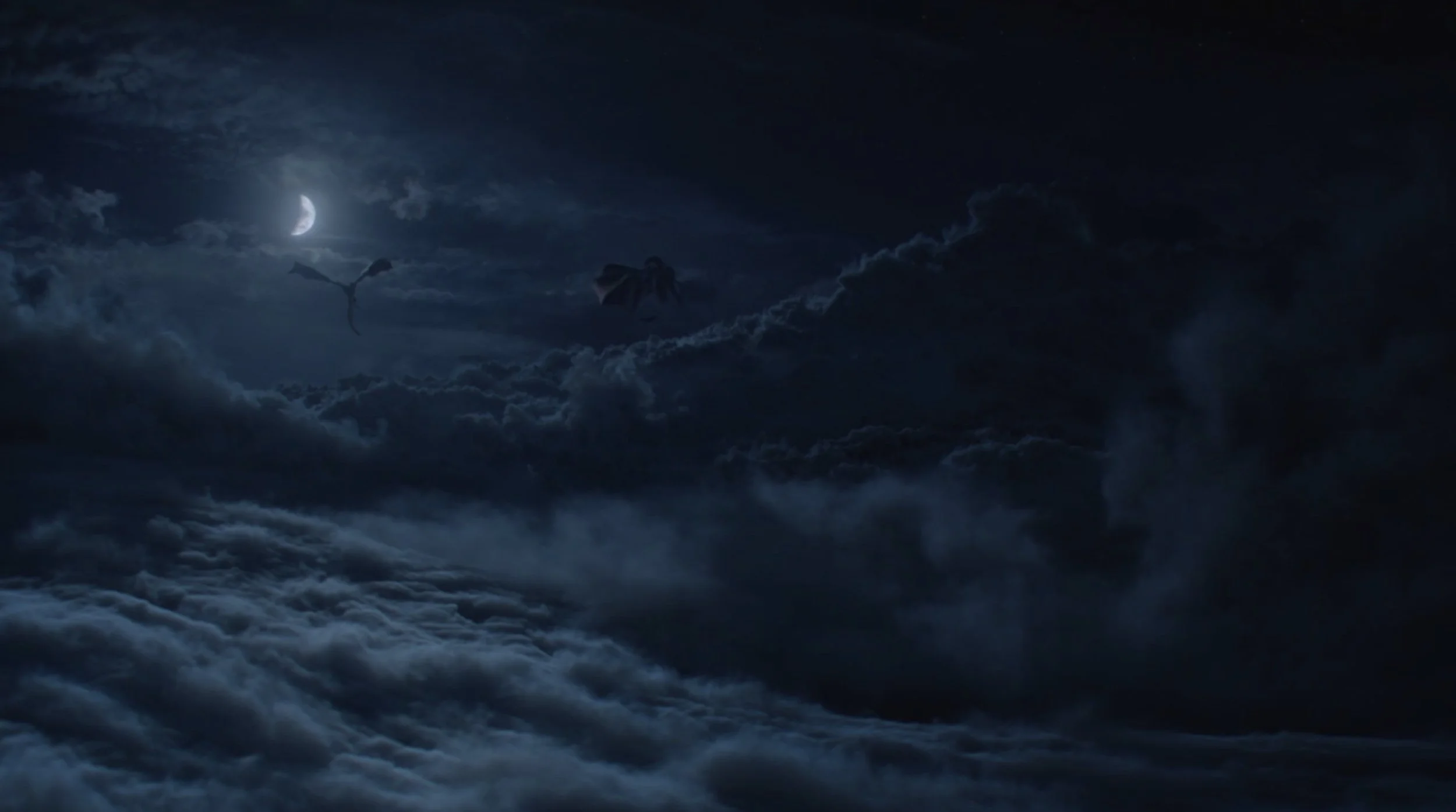
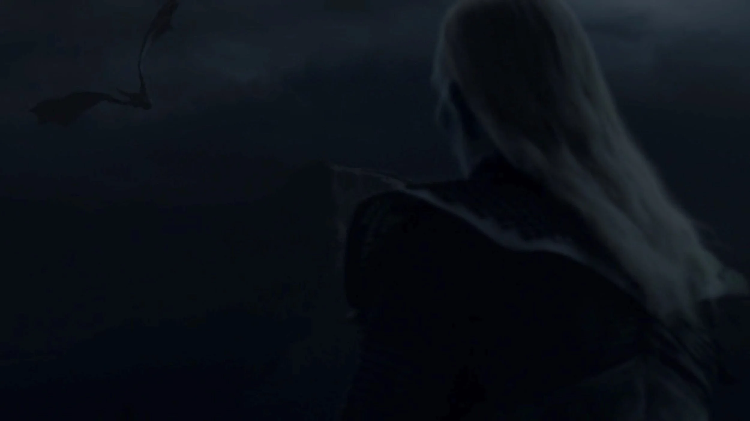
A dragon’s dark silhouette emerges in a (relatively) light strip of the sky, its power and speed juxtaposed with the eerie calm of the white walker whose pale hair and skin break the darkness on the opposite side of the screen.
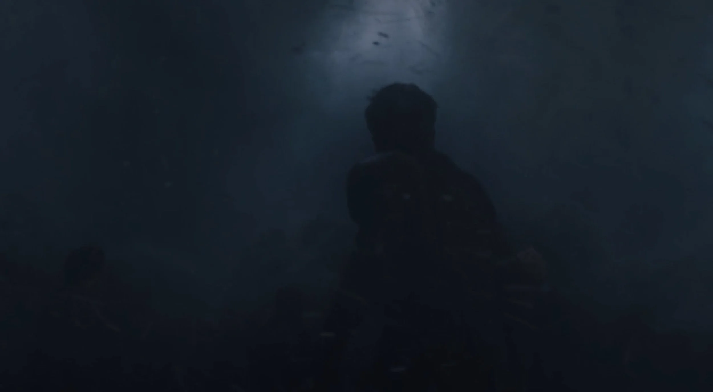
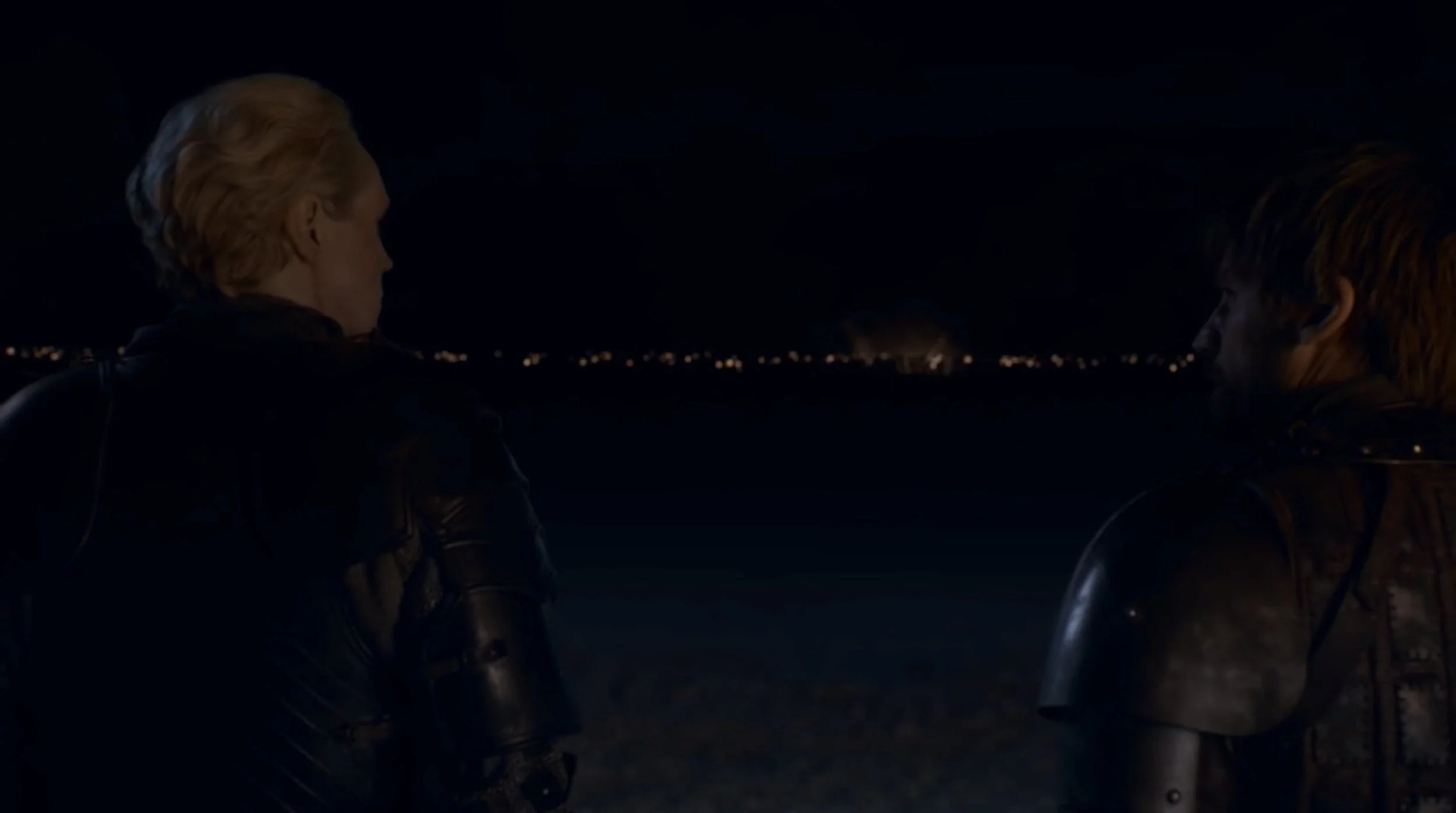
Like Jaime—who appears at the center of this still, peering up at the gathering light—we don’t know what’s coming but we do know exactly where to look. Our eyes are led by three converging aspects: the tonal contrast created by the small and sudden burst of light; the character’s choice to pause in battle to turn and focus on the light; and the roughly triangular form of Jamie’s body, which seems to physically point to that light.
Fire in the context of all this infuriating, chaotic darkness not only represents hope as an abstract symbol but actually inspires hope in both the characters and the audience when it appears in key dramatic moments, such as the lighting of the Dothraki weapons, the arrival of Dany and Drogon on the battlefield, and Melisandre’s tense and miraculous igniting of the fire pits. Likewise, scenes where we see the fire either go out or prove ineffectual cause our throats to clench and stomachs to drop.
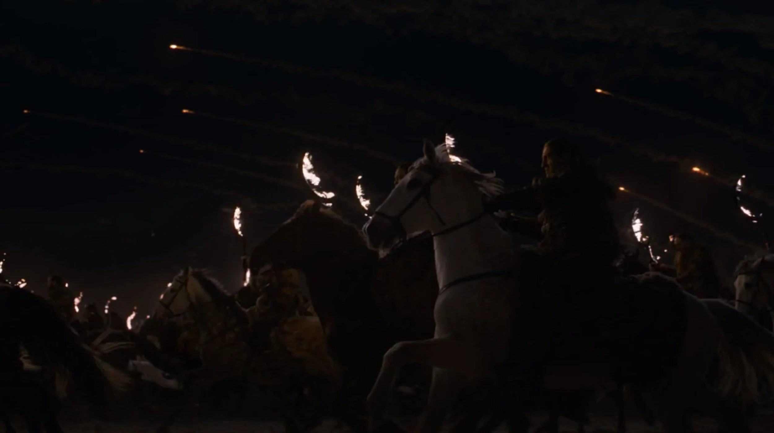
During the Dothraki charge at the very beginning of the battle, their way and our optimism are lit by the flaming arakhs and the cannonballs that punctuate the sky like comets.
Then we watch on as, one by one, their lights are extinguished. And we know something truly terrible is coming.
Repetition and Mirroring
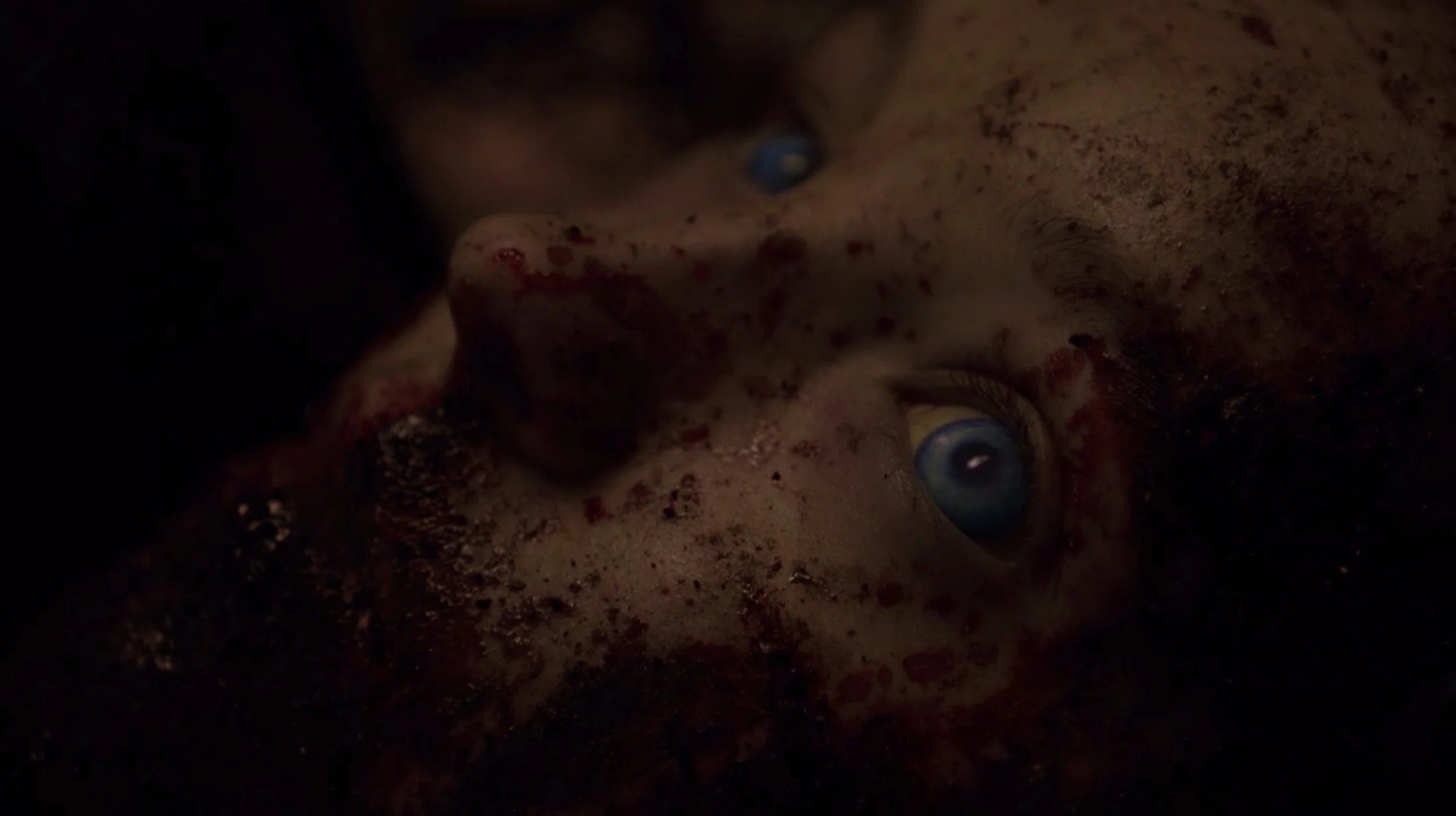
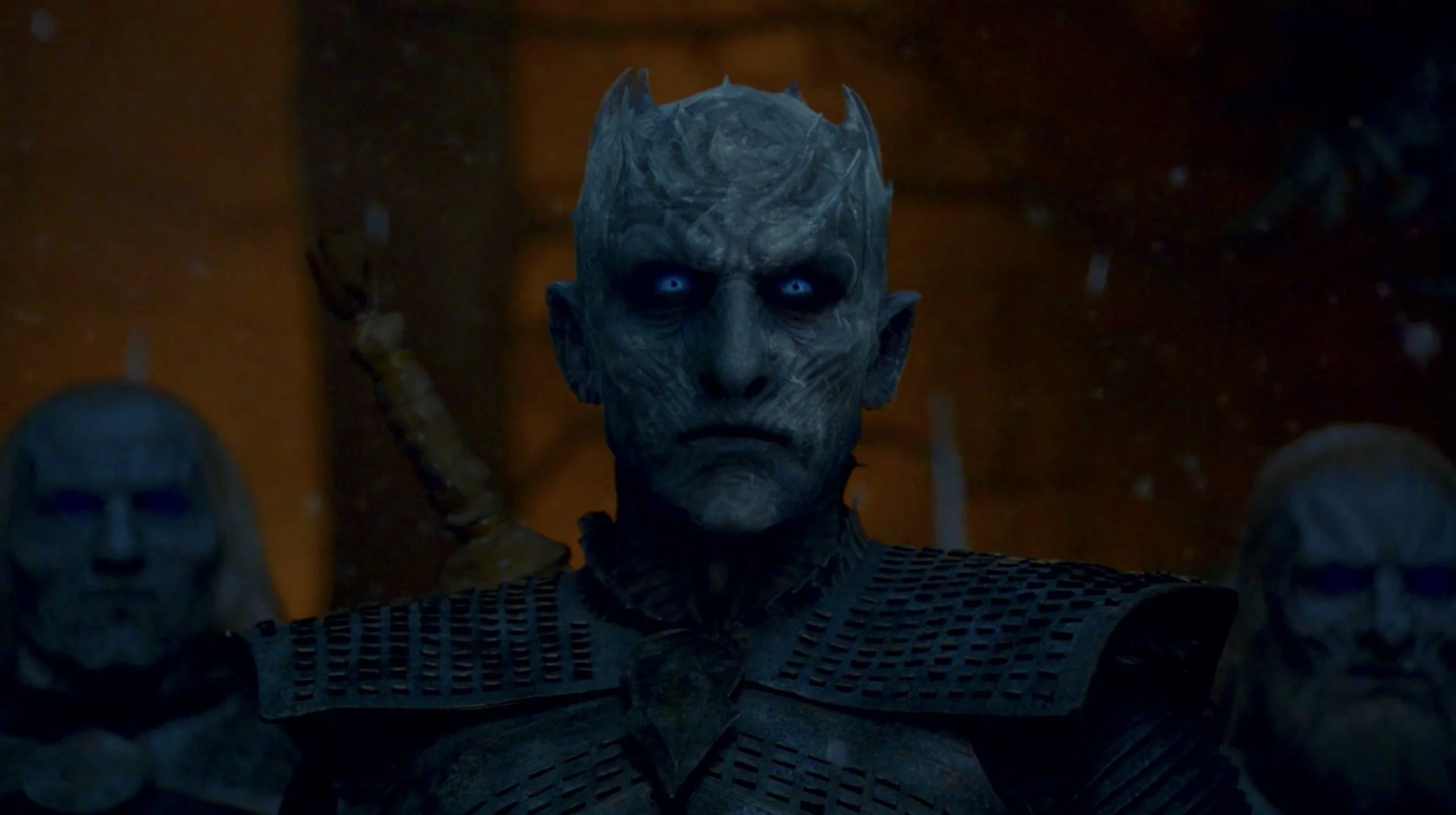
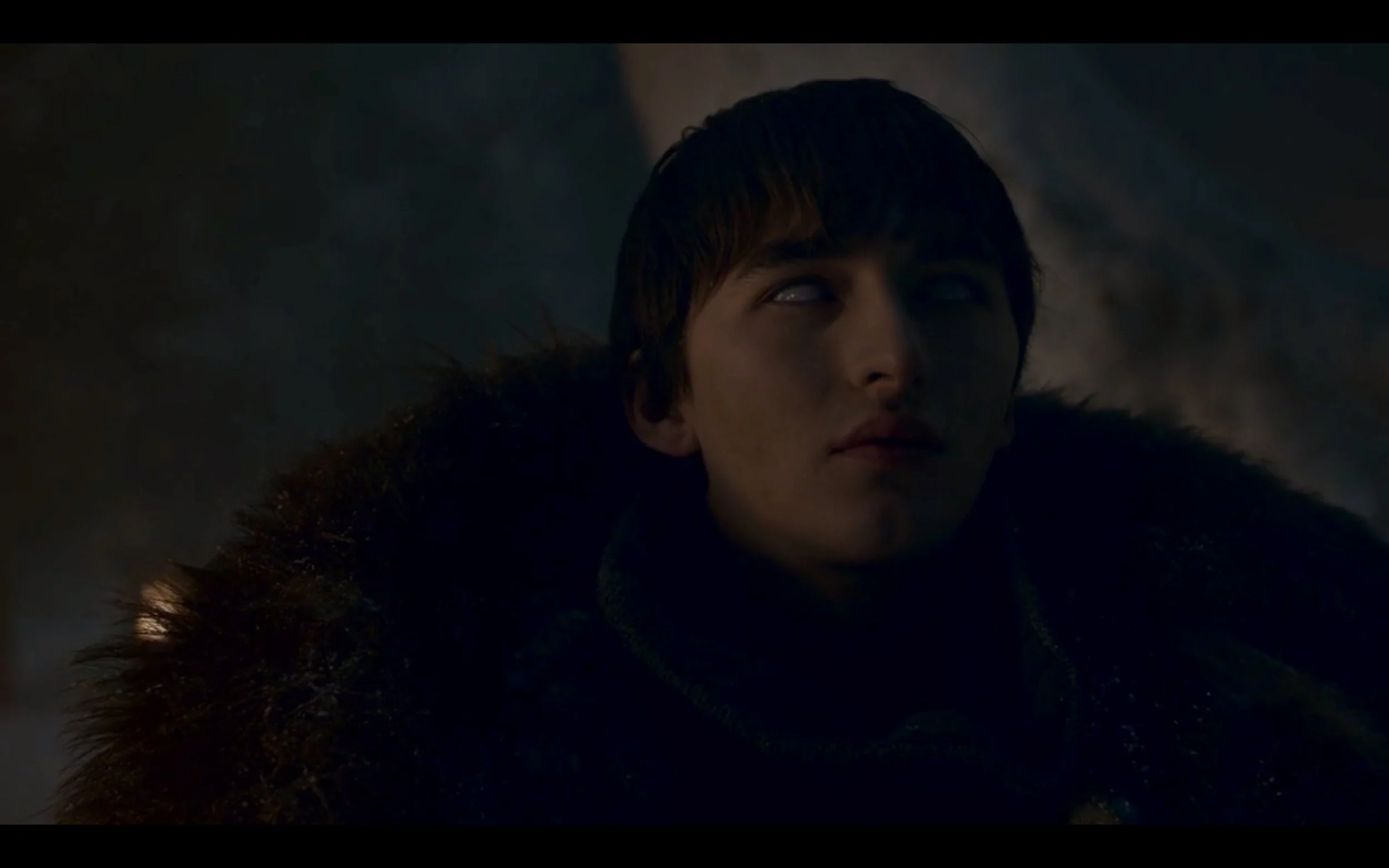
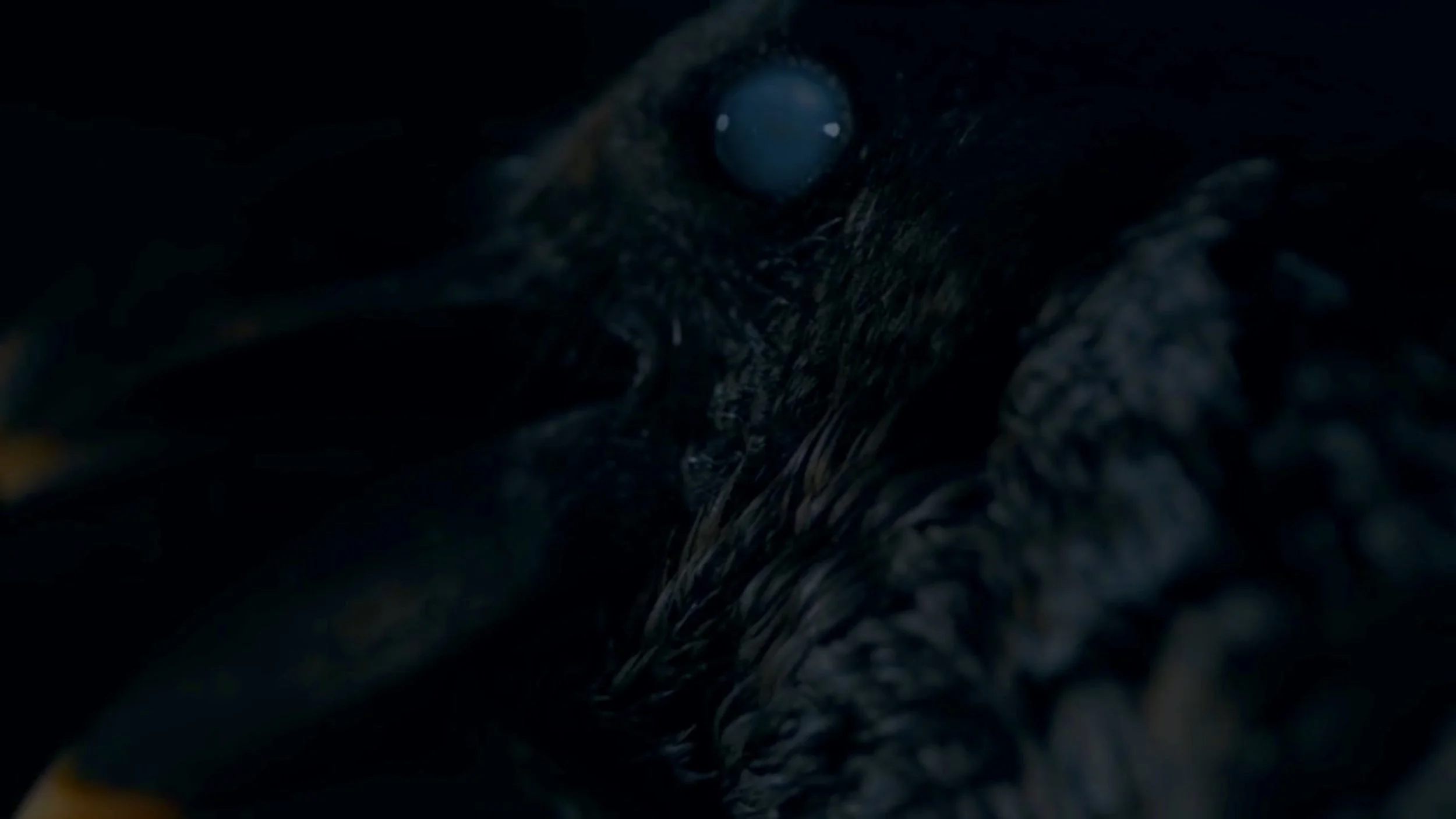
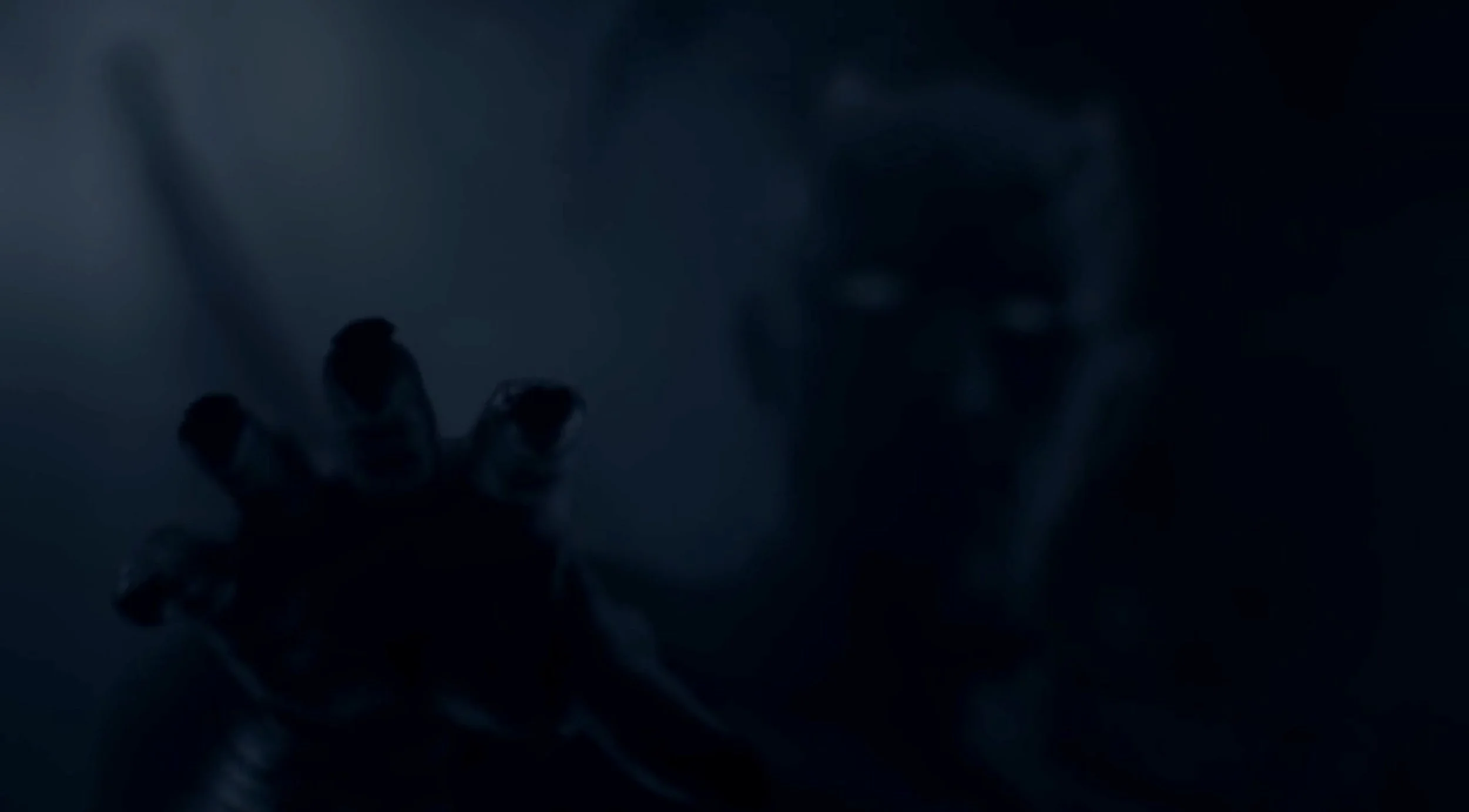
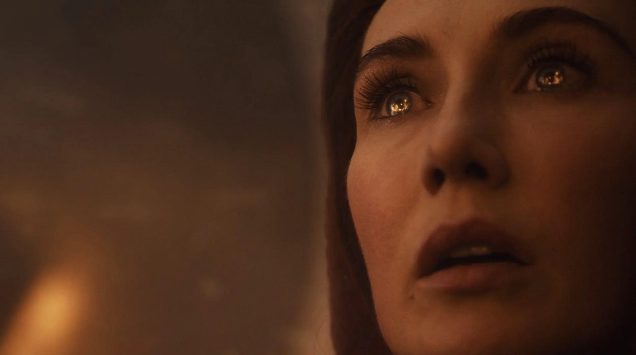
“The Long Night” utilized A LOT of repetition, focusing on the motifs of hands, doors, and, especially, eyes. Eyes and hands are of course both highly expressive body parts, able to communicate a great deal about a character’s psychological state or purpose without the use of dialogue. In this episode, eyes often took on additional significance as they reinforced the character’s role in the fight. We get long shots of the red priestess Melisandre’s eyes filled with the reflected flames of her god (see below), while Bran’s tie to the Night King is made clear through the eerie similarity between not only the pale warged eyes of the crows and those of the wights, but also Bran’s own warged eyes and the obscured gaze of the Night King.
In quick succession we see Bran warg…
…into crows…
…who fly to the Night King. Each plot beat comes to a head when the characters’ eyes either turn bluish-white or, in the case of the Night King, the bluish white eyes become visible in the darkness. The Night King also reaches out towards the crows—and Bran—in that last moment, his hand movement further reinforcing the fact that getting to Bran is indeed his ultimate goal in this battle.
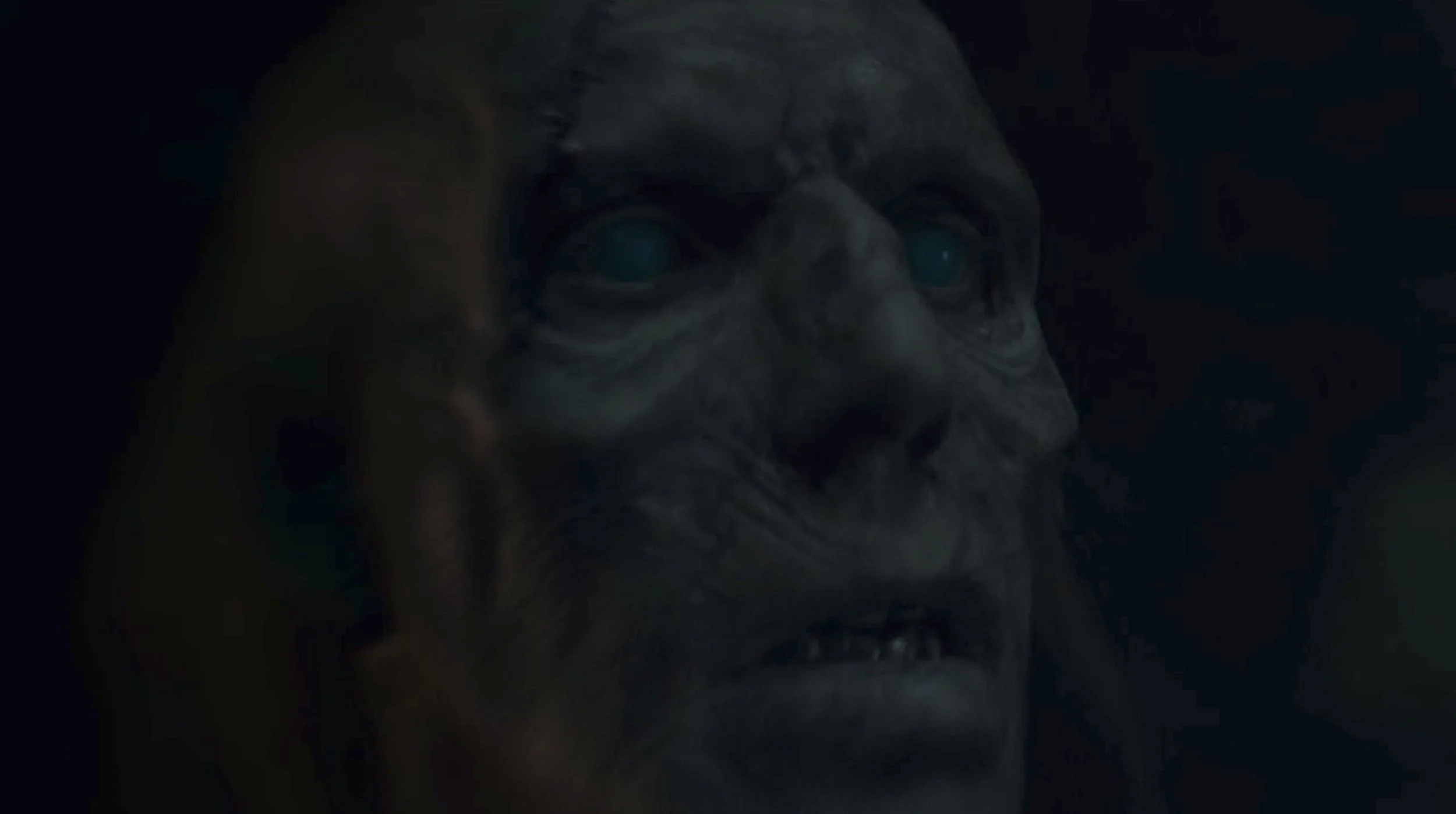
The clouded-with-death versus living-with-fire motif is clearest in the dramatic mirroring of Melisandre's and a wight’s slightly upturned faces in two extended shots. First, we see Mel’s lovely, healthy visage bathed in light, facing inward from the right side of the frame, her irises reflecting the fire she has just lit through her faith (and magic). A few minutes later, a wight’s sallow, damaged death mask looks up from the left, his fully occluded eyes pale spots in the darkness. These two moments happen far enough apart over the course of the runtime that they probably never consciously register with most viewers. Even so, their presence helps to solidify the visual language around the oppositional elements of ice and fire, dark and light, death and life, and that language is “read” by viewers whether they are fully aware of it or not.
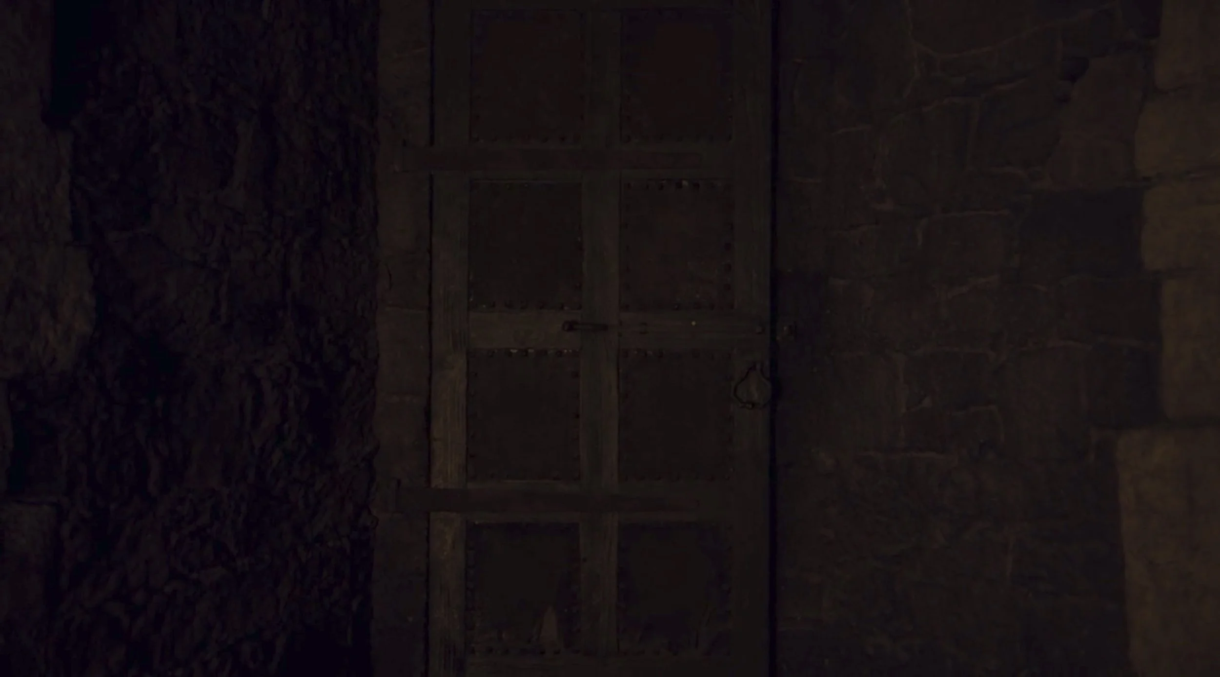
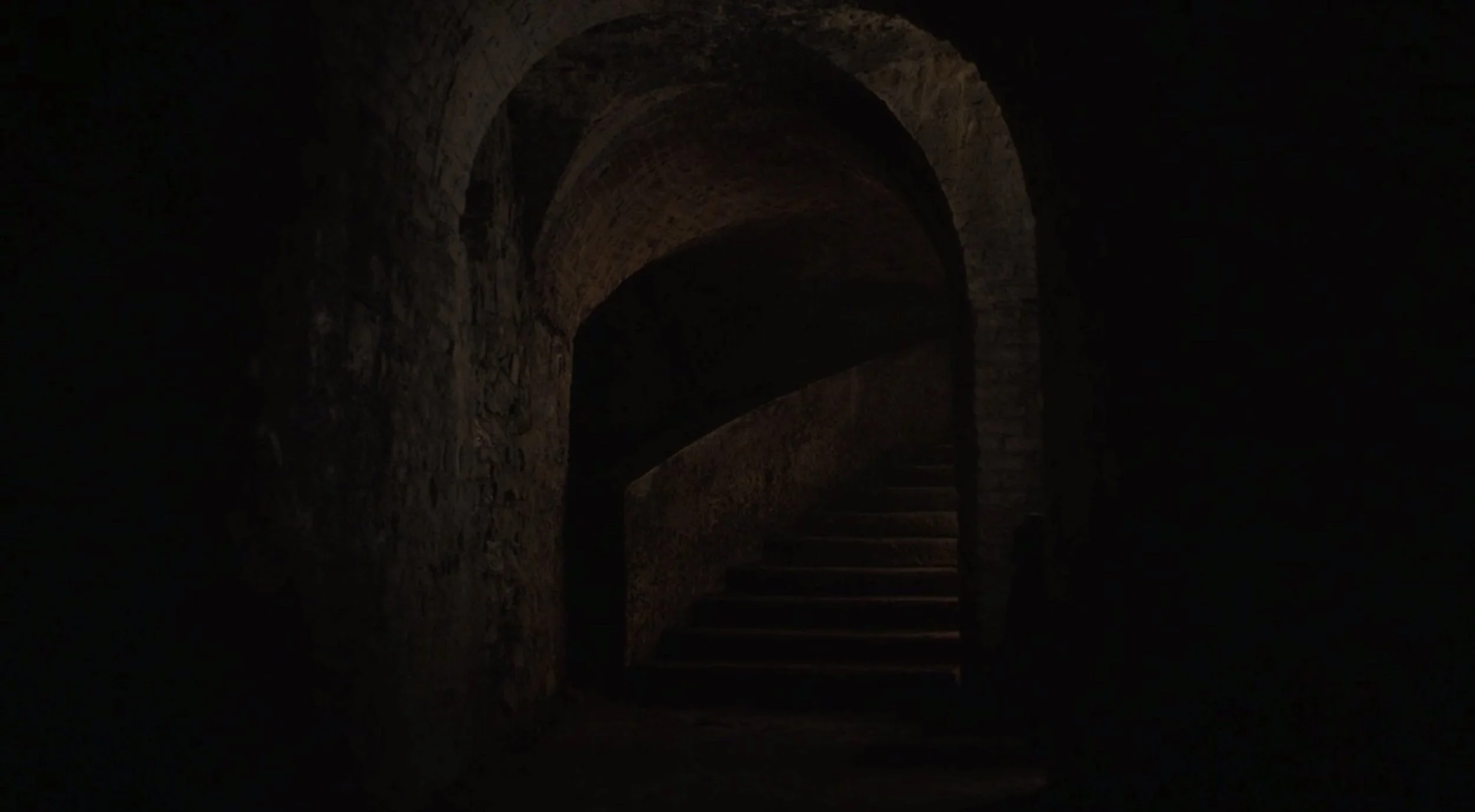
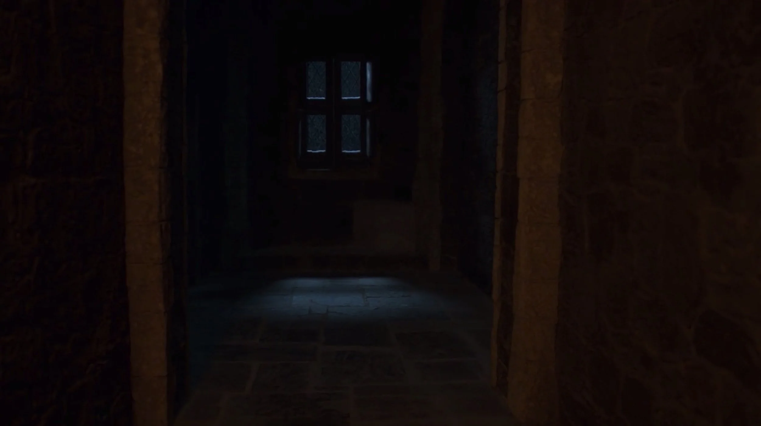
Inside Winterfell, doors become their own visceral symbols of uncertainty. Each door or intersecting hallway offers a new possibility of the POV character encountering either help and safety or wights and death. The camera lingers on each entrance a little longer than is actually necessary for the plot alone, allowing the viewer to feel the tension experienced by the characters.
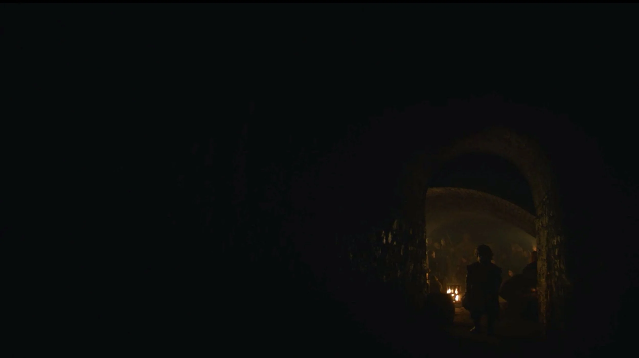
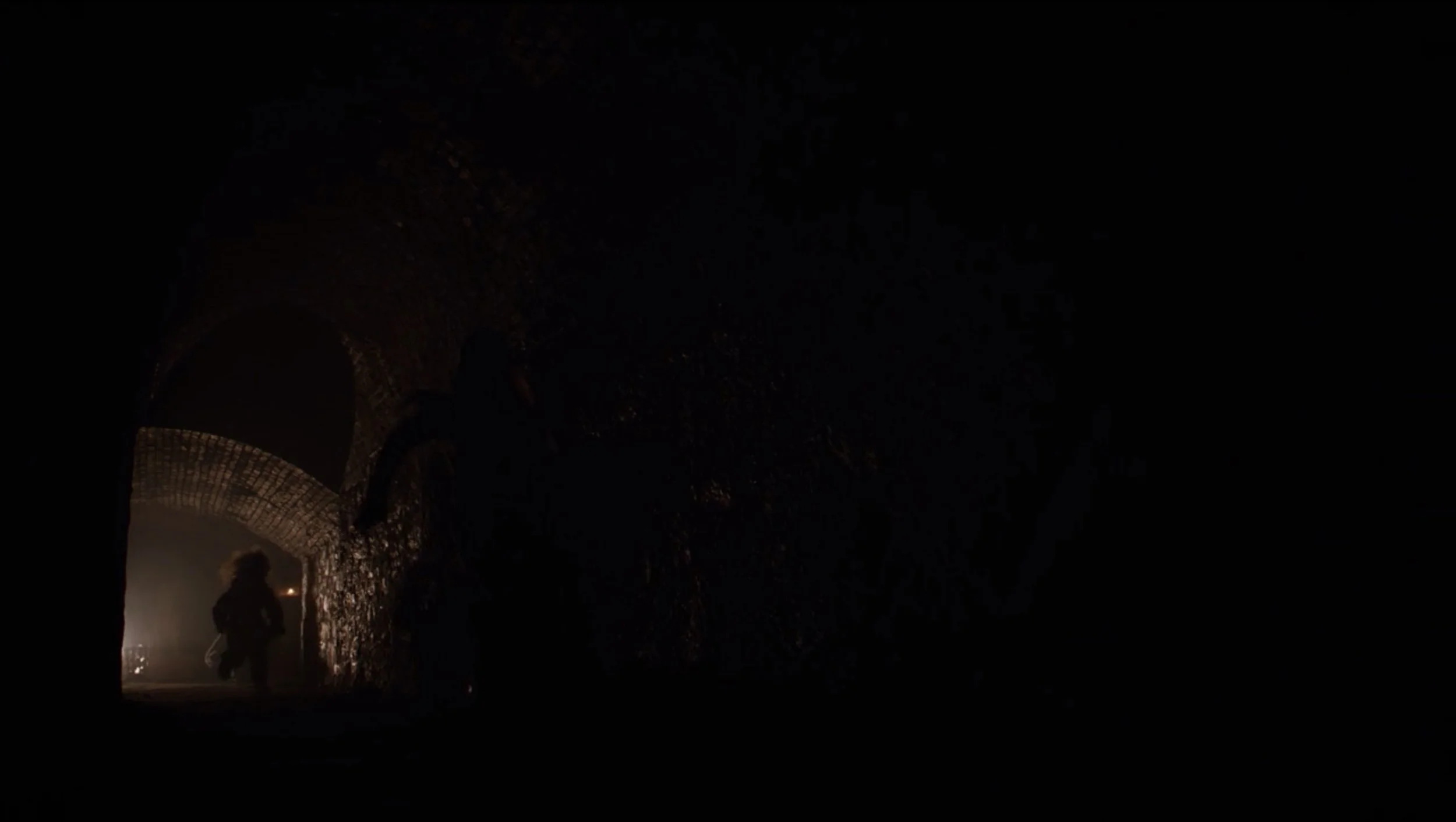
Although most of the doors we see are closed or empty, roughly centered in the frame and taking up about a third of the screen, two dramatic exceptions occur during the scenes in the crypts. The first instance comes at the beginning of the battle and the second at the end. Together, these two moments represent another important instance of mirroring in the episode, with the flipped imagery and action of the second emphasizing the fulfillment of the tension in the first.
At the beginning of the battle, we see Tyrion’s small, still figure in the bottom right of the screen, silhouetted by firelight and facing pitch darkness. The doorway surrounds him like a mouth, as if he is about to be swallowed by the encompassing black. The image is a perfect distillation of the scenes set in the crypts—for the experience of those most helpless people clinging to a faint hope of safety while literally and metaphorically surrounded by death.
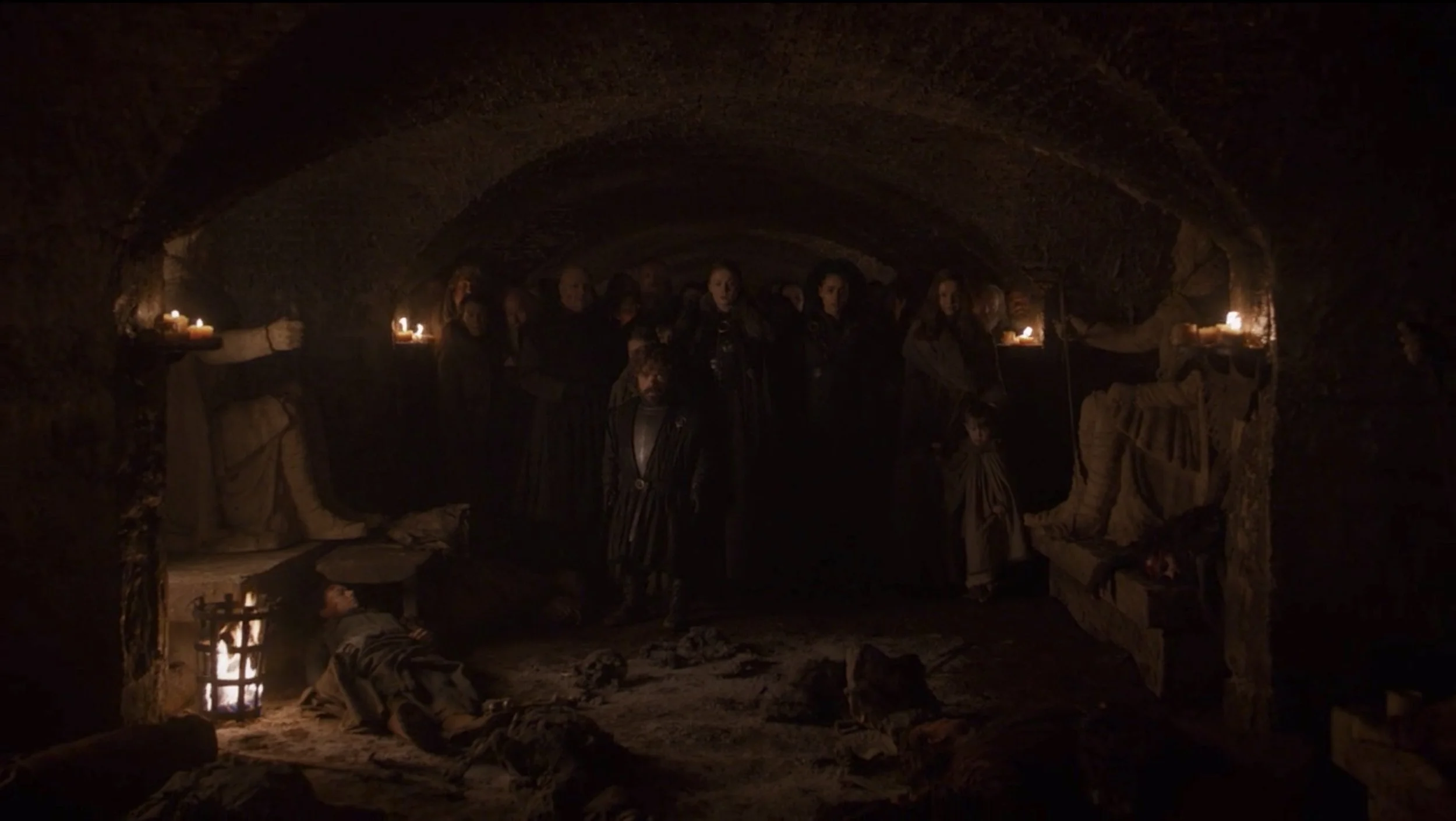
The image is flipped near the end of the battle, and we see a child, along with others, fleeing the darkness that has now invaded the crypts. The blackness is just as ominous here, but now represents the horrors that share the characters’ space rather than those that surround it.
Art History in the Crypt
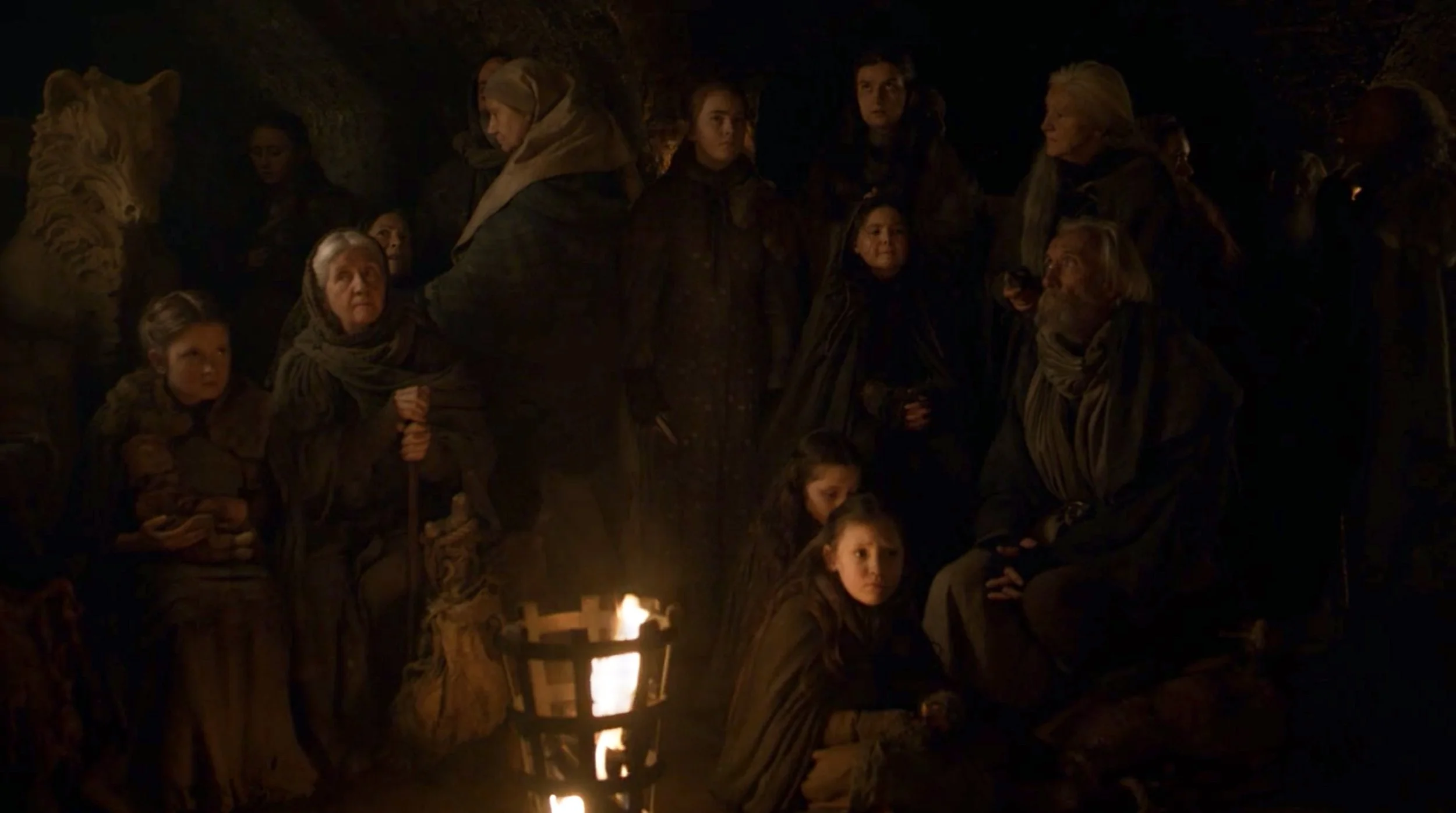
The camera’s tendency to rest on dynamic collections of still, expressive, and starkly lit figures in the crypts clearly evokes the Golden Age of Dutch painting, the most famous examples of which are probably Rembrandt’s The Nightwatch (1642), which in name at least seems uniquely appropriate, and The Anatomy Lesson of Dr. Nicolaes Tulp (1632), the central corpse of which becomes repeated a dozen-fold in this new context.
Another apt comparison can be found in the work of Rembrandt’s contemporary Gerrit Dou, who often represented his figures in candlelight, surrounded by both darkness and rounded arches.
Within the show, the staid, crowded images perfectly communicate the uneasy tension and claustrophobia of those waiting in the crypts while the battle rages on everywhere else.
Of course, GoT’s scenes do not attempt to directly recreate any particular painting. Rather, the show seems to be using the Golden Age as a visual and cultural touchstone to evoke feelings of claustrophobia, psychological tension, and historical realism within otherwise fantastical settings and events.
Final Notes
Although directors tend to get most of the credit (or blame) for a given episode, the final product is always the result of the decisions and work of many people. In this case, the episode’s Director of Photography, Fabian Wagner, probably deserves a large chunk of the credit for the visuals. I would also be remiss to not at least nod to the perfectly unnerving sound design, especially Ramin Djawadi’s haunting scores, without which the imagery would not have been nearly so impactful.
Finally, I have (slightly) tweaked the brightness and brilliance for most of the stills in this post to improve legibility and cropped out the black bars that bordered the top and bottom of my original screenshots. Otherwise, the images are as they appeared in the episode.
